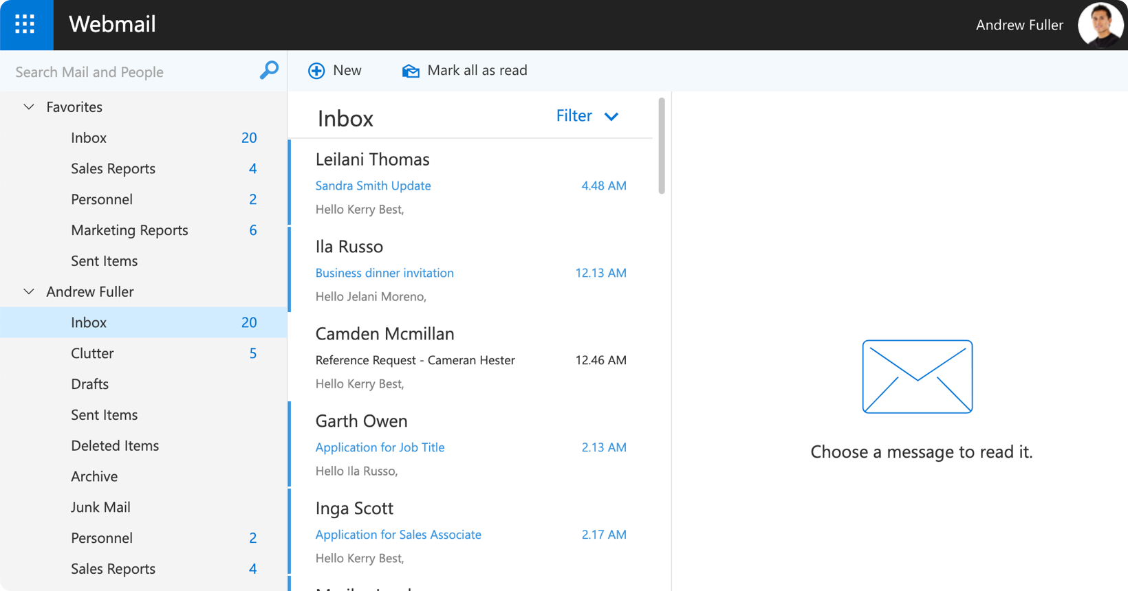
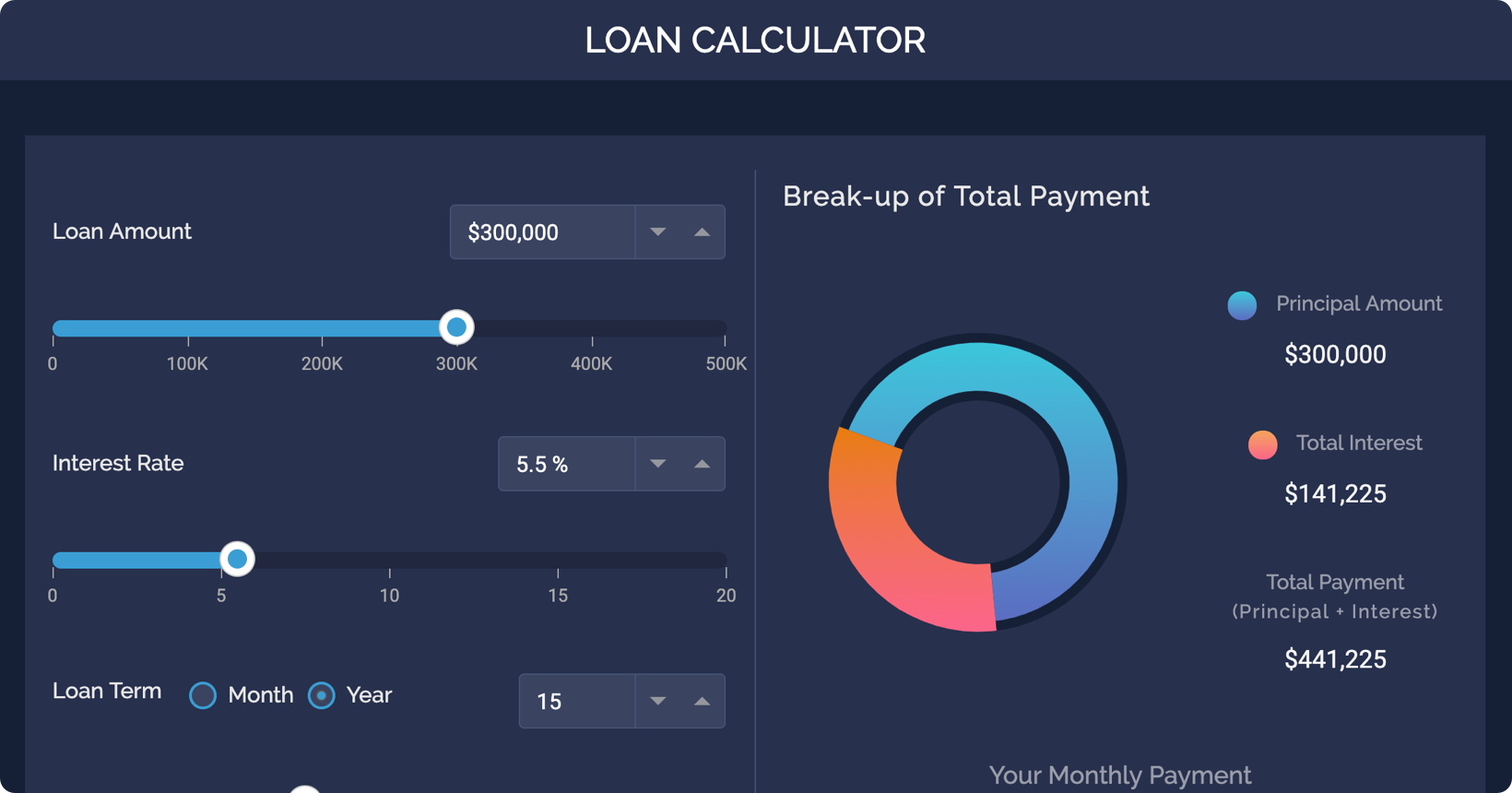
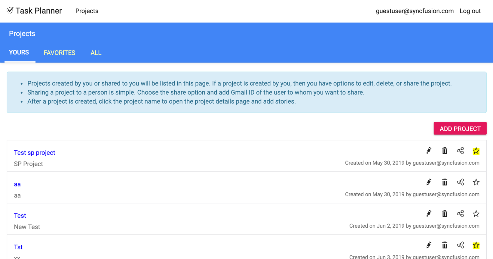
145+ enterprise-grade, high-performance JavaScript UI components with first-class TypeScript support. Built for use in plain JavaScript or TypeScript projects and compatible across frameworks (React, Angular, Vue) — lightweight, modular, responsive, and touch-friendly.
Quick Links
Live Demos • Documentation • API Reference • Free 30-Day Trial • Community License
- Vanilla JS + TypeScript – Use components without a framework or with any framework; TypeScript definitions included for strong typing
- Modular packages – Import only required packages for smaller bundles
- Performance – Virtualization, optimized rendering, and lazy loading
- Theming & Accessibility – Modern themes and WCAG-compliant accessibility
- AI-Ready – AI AssistView and other AI-enabled controls
- Stable Releases – Regular updates and comprehensive changelogs
Install the base package and any specific control packages you need. The examples use npm in PowerShell (Windows).
npm install @syncfusion/ej2 @syncfusion/ej2-grids @syncfusion/ej2-charts; # install any specific packages you needFor TypeScript projects, ensure tsconfig.json has "esModuleInterop": true and include types if needed.
Explore components with links to framework-agnostic documentation and demos.
| Category | Component | Features | Documentation | Demo Link |
|---|---|---|---|---|
| AI / Smart | AI AssistView | AI-driven assistance, contextual suggestions, real-time interaction, integrates with editors | Link | Demo |
| Smart TextArea | Intelligent editing, auto-complete suggestions, context-aware corrections, AI-powered | Link | Demo | |
| Smart Paste Button | Intelligent paste handling, content formatting, smart insertion, AI-enhanced | Link | Demo | |
| Grids | Data Grid | Virtual scrolling, Excel-like editing/sorting/filtering, large dataset support, export to Excel/PDF, grouping & aggregation | Link | Demo |
| Pivot Table | Drag-and-drop summarization, calculated fields, chart integration, virtual scrolling, Excel export | Link | Demo | |
| Tree Grid | Hierarchical data display, expand/collapse, row templates, editing & drag-and-drop, virtualization | Link | Demo | |
| Charts & Data Viz | Charts | 50+ chart types, zooming & panning, interactive legends, real-time updates, animation | Link | Demo |
| 3D Charts | 3D visualization, rotation & perspective, multiple series, high customization | Link | Demo | |
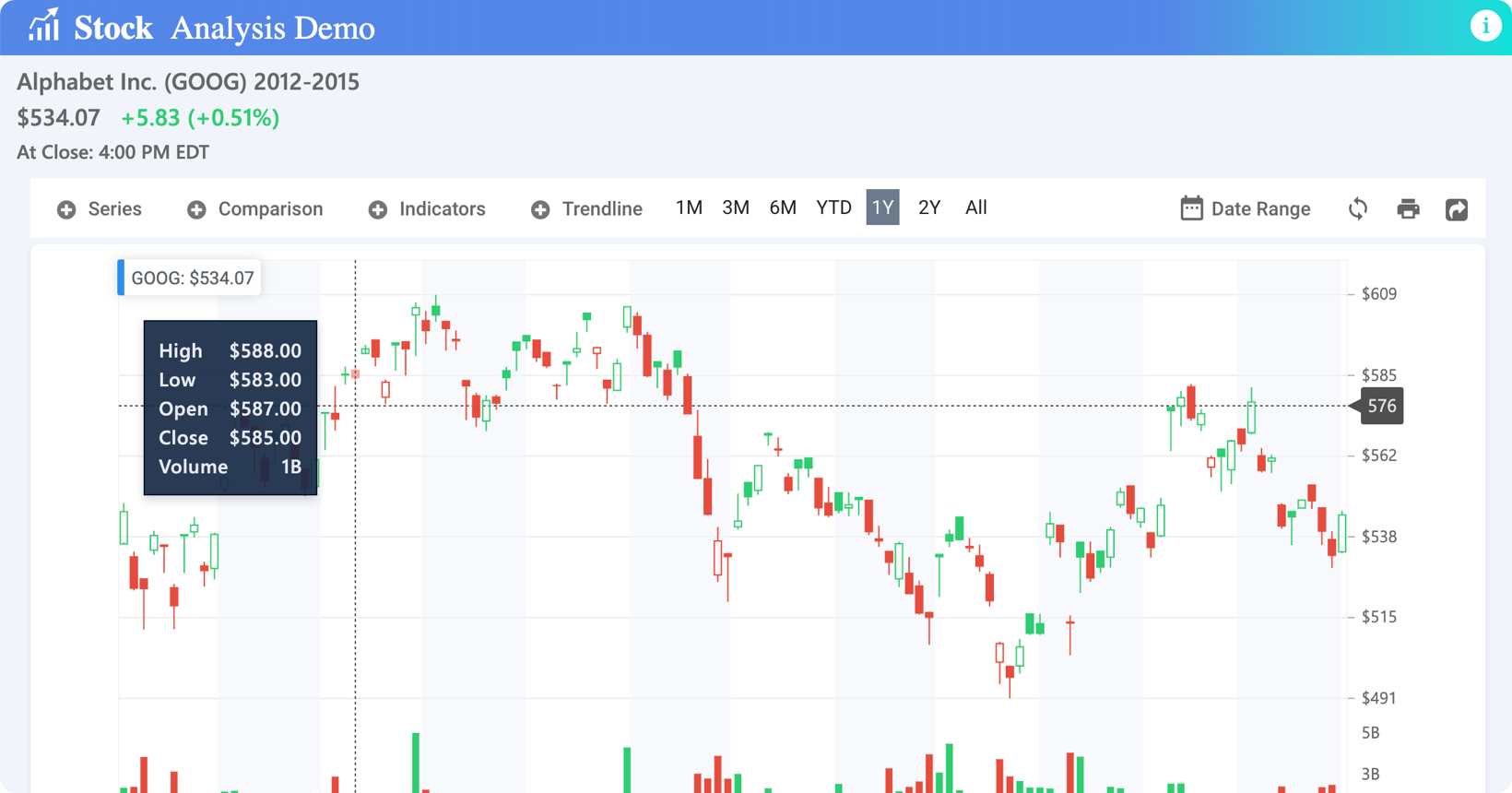
| Stock Chart | Financial time-series, technical indicators, range navigator, candle/OHLC | Link | Demo | |
| Circular Gauge | Analog gauges, ranges & needles, annotations, directional indicators | Link | Demo | |
| Linear Gauge | Progress/measurement bars, ranges, pointers, custom shapes | Link | Demo | |
| Maps | Geo-spatial plotting, markers & shapes, drill-down, bubble visualization | Link | Demo | |
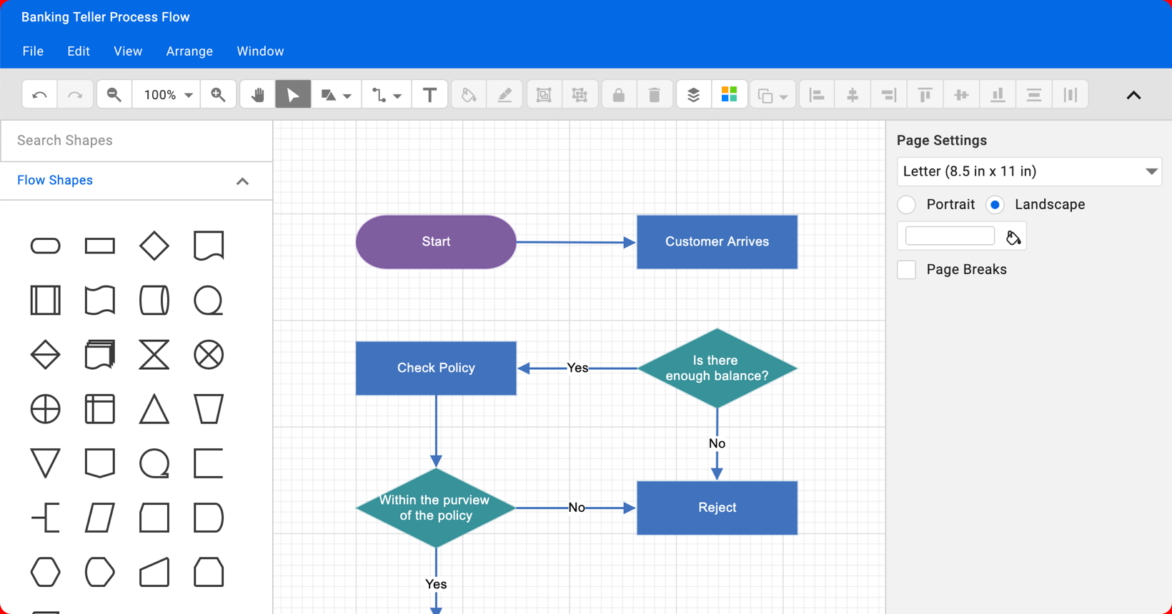
| Diagram | Flowcharts & org charts, drag-and-drop, connectors, undo/redo, AI-enhanced | Link | Demo | |
| HeatMap | Density visualization, gradient colors, row/column labels, tooltip | Link | Demo | |
| TreeMap | Hierarchical rectangles, drill-down, color mapping, legend | Link | Demo | |
| Bullet Chart | Compact performance metering, ranges & targets, comparisons | Link | Demo | |
| Kanban | Drag-and-drop boards, swimlanes, card customization, drag multiple cards | Link | Demo | |
| Sparkline | Inline trend charts, compact size, multiple types | Link | Demo | |
| Barcode | 1D/2D barcode generation, multiple formats, scanning support | Link | Demo | |
| Smith Chart | RF engineering data, impedance/admittance, markers | Link | Demo | |
| Range Selector | Time-range navigation, chart integration, zoom support | Link | Demo | |
| Scheduling | Scheduler | Multiple views (day/week/month), drag-and-drop events, multiple event selection, resource grouping | Link | Demo |
| Gantt Chart | Project timelines, task dependencies, progress tracking, critical path | Link | Demo | |
| Calendar | Multiple views, event rendering, multi-date selection | Link | Demo | |
| DatePicker | Inline/dropdown mode, validation, custom formats | Link | Demo | |
| DateRangePicker | Start/end selection, preset ranges, calendar preview | Link | Demo | |
| DateTimePicker | Combined date & time, format customization, strict mode | Link | Demo | |
| TimePicker | 24/12-hour format, interval selection, spin buttons | Link | Demo | |
| Dropdowns | AutoComplete | Suggestion dropdown, filtering, multi-select, remote data | Link | Demo |
| ComboBox | Hybrid textbox + dropdown, search & filtering, grouping | Link | Demo | |
| MultiSelect Dropdown | Tag/chip selection, checkbox mode, remote binding | Link | Demo | |
| Dropdown List | Simple selection, grouping, virtual scrolling | Link | Demo | |
| ListBox | Multi-selection, drag-and-drop reordering, checkbox support | Link | Demo | |
| DropDown Tree | Hierarchical selection, checkboxes, multi-select | Link | Demo | |
| MultiColumn ComboBox | Multiple value columns, custom templates, search | Link | Demo | |
| Mention | @tagging autocomplete, suggestions, custom templates | Link | Demo | |
| Inputs | TextBox | Validation & masking, floating label, icons | Link | Demo |
| TextArea | Auto-resize, character counter, resize handles | Link | Demo | |
| Numeric TextBox | Spin buttons, formatting, strict mode | Link | Demo | |
| Masked TextBox | Input format enforcement (phone/SSN/etc.), prompt char | Link | Demo | |
| CheckBox | Tri-state, label position, indeterminate state | Link | Demo | |
| RadioButton | Group selection, label customization, checked state | Link | Demo | |
| Color Picker | Palette/sliders, gradient support, opacity | Link | Demo | |
| File Upload | Drag-and-drop, progress tracking, multiple files, validation | Link | Demo | |
| Range Slider | Dual-thumb, step & limits, tooltip | Link | Demo | |
| Switch | On/off toggle, custom labels, animation | Link | Demo | |
| Signature | Touch/mouse capture, save as image, clear/undo | Link | Demo | |
| Rating | Star/custom shapes, partial rating, precision | Link | Demo | |
| OTP Input | Auto-focus & masking, paste support, resend timer | Link | Demo | |
| Buttons | Button | Variants & icons, loading state, disabled | Link | Demo |
| ButtonGroup | Grouped buttons, toggle/selection, vertical mode | Link | Demo | |
| SplitButton | Primary + dropdown, split actions, icons | Link | Demo | |
| Dropdown Menu | Menu items, icons & separators, submenus | Link | Demo | |
| Progress Button | Loading indicator, spinner integration, progress percentage | Link | Demo | |
| Chips | Tags/filters, deletable, custom templates | Link | Demo | |
| FAB (Floating Action Button) | Prominent action, motion effects, extended modes | Link | Demo | |
| Speed Dial | Multiple actions, directional expansion, FAB extension | Link | Demo | |
| Navigation & Layout | Accordion | Collapsible sections, multiple expand, templates | Link | Demo |
| Tabs | Tabbed content, scrollable, closeable tabs | Link | Demo | |
| TreeView | Hierarchical navigation, drag-and-drop, checkboxes | Link | Demo | |
| Toolbar | Button collection, overflow popup, responsive | Link | Demo | |
| Sidebar | Side panel, collapsible, positioning | Link | Demo | |
| Menu Bar | Navigation menu, submenus, keyboard support | Link | Demo | |
| Context Menu | Right-click actions, custom items, submenus | Link | Demo | |
| Carousel | Sliding panels, auto-play, indicators | Link | Demo | |
| AppBar | Top/bottom bar, actions & content, responsive | Link | Demo | |
| Breadcrumb | Path navigation, overflow menu, custom separators | Link | Demo | |
| Ribbon | Tabbed toolbar, grouped commands, contextual tabs | Link | Demo | |
| Stepper | Multi-step process, validation, linear/non-linear | Link | Demo | |
| Pager | Pagination controls, page size selector, numeric/symbolic | Link | Demo | |
| File Manager | File browsing, upload/rename/delete, drag-and-drop | Link | Demo | |
| Dialog | Modal/popover, custom content, buttons & actions | Link | Demo | |
| Card | Content container, headers/footers, actions | Link | Demo | |
| Splitter | Resizable panels, horizontal/vertical, nested | Link | Demo | |
| ListView | Scrollable list, templates, selection & grouping | Link | Demo | |
| Tooltip | Hover/contextual hints, positioning, custom content | Link | Demo | |
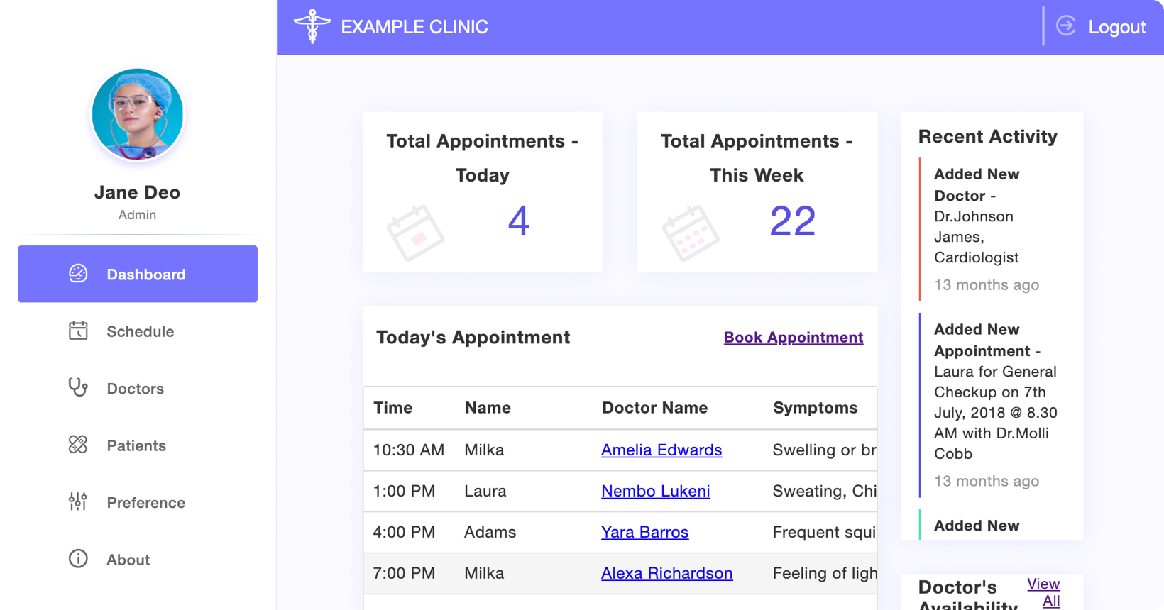
| Dashboard Layout | Drag-and-drop widgets, resizing, responsive | Link | Demo | |
| Forms & Editors | Query Builder | Visual query construction, conditions & operators, rule templates | Link | Demo |
| Rich Text Editor | WYSIWYG formatting, tables & media, AI-powered, markdown support | Link | Demo | |
| In-place Editor | Inline/pop-up editing, grid integration, custom UI | Link | Demo | |
| Image Editor | Crop/rotate/filters, annotations, redaction | Link | Demo | |
| Block Editor | Block-based content, modular editing, preview mode | Link | Demo | |
| Notifications | Toast | Temporary notifications, auto-dismiss, progress & actions | Link | Demo |
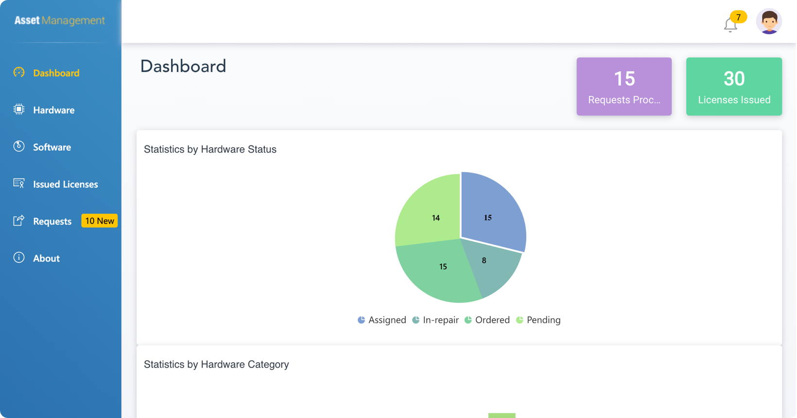
| Progress Bar | Determinate/indeterminate, segmented, circular mode | Link | Demo | |
| Spinner | Loading indicator, size variants, overlay support | Link | Demo | |
| Badge | Count/status indicator, positioning, dot/overlap | Link | Demo | |
| Skeleton | Loading placeholder, shimmer effect, custom shapes | Link | Demo | |
| Message | Inline alerts/status, severity levels, dismissible | Link | Demo |
Full list of 145+ components → Documentation
Install packages:
npm install @syncfusion/ej2 --save; npm install --save-dev typescriptCreate index.html and bundle with your preferred bundler (Webpack/Rollup/Vite). Example minimal ES module usage:
index.html
<!doctype html>
<html>
<head>
<meta charset="utf-8" />
<title>Syncfusion EJ2 - TypeScript Example</title>
<link rel="stylesheet" href="https://cdn.syncfusion.com/ej2/material.css" />
</head>
<body>
<div id="grid"></div>
<script type="module" src="./dist/main.js"></script>
</body>
</html>src/main.ts
import { Grid, Page } from '@syncfusion/ej2-grids';
import '@syncfusion/ej2-base/styles/material.css';
Grid.Inject(Page);
const data = [ { OrderID: 10248, CustomerName: 'Paul' }, { OrderID: 10249, CustomerName: 'Karin' } ];
const grid = new Grid({
dataSource: data,
allowPaging: true,
columns: [
{ field: 'OrderID', headerText: 'Order ID', width: 120 },
{ field: 'CustomerName', headerText: 'Customer Name', width: 150 }
]
});
grid.appendTo('#grid');Bundle with a modern bundler or ts-node for quick testing.
- Live Demos – https://ej2.syncfusion.com/demos/
- Documentation – https://ej2.syncfusion.com/documentation/
- API Reference – https://ej2.syncfusion.com/documentation/api/
- Theme Studio – https://ej2.syncfusion.com/themestudio/
- Release Notes – https://ej2.syncfusion.com/documentation/release-notes/
- Support – https://support.syncfusion.com/support/tickets/create
This is a commercial product subject to the Syncfusion End User License Agreement (EULA).
Free Community License is available for qualifying users/organizations:
- Annual gross revenue < $1 million USD
- 5 or fewer total developers
- 10 or fewer total employees
Community license allows free use under these conditions.
Purchase options and pricing: https://www.syncfusion.com/sales/products
30-day free trial: https://www.syncfusion.com/downloads/javascript
Community License details & FAQ: https://www.syncfusion.com/products/communitylicense
Full EULA: https://www.syncfusion.com/eula/es/
© 2026 Syncfusion, Inc. All Rights Reserved.