Take it for a SPIN! 💫
v7 removes the server-side module from this package (see breaking changes below). The client API is unchanged from v6.
Version 5.x.x is in maintenance mode. For bug fixes or forks, check out branch v5.x.x. Version 6.x.x is also available if you need the react-multistep/server export - pin to 6.1.0.
Version 6 is a complete rewrite with modern React patterns and architecture. This is a breaking change from v5.x.x.
v6 is now headless - the MultiStep component manages state and logic, but
you control the UI. This gives you complete flexibility over how steps,
navigation, and progress indicators look and behave.
Before (v5): Built-in navigation UI with limited customization
<MultiStep showNavigation activeStep={0} prevButton={...} nextButton={...}>
  {/* steps */}
</MultiStep>
Now (v6): Bring your own UI, powered by the useMultiStep hook
<MultiStep>
  <StepOne title="Personal Info" />
  <StepTwo title="Address" />
</MultiStep>;The useMultiStep hook is the core of v6. Any component inside
<MultiStep> can access wizard state and navigation:
import { useMultiStep } from "react-multistep";

function CustomNavigation() {
  const {
    activeStep, // Current step index (0-based)
    stepCount, // Total number of steps
    steps, // Array of step metadata
    next, // Go to next step
    previous, // Go to previous step
    goToStep, // Jump to specific step
    currentStepValid, // Is current step valid?
  } = useMultiStep();

  return (
    <nav>
      <button onClick={previous} disabled={activeStep === 0}>
        Back
      </button>
      <span>Step {activeStep + 1} of {stepCount}</span>
      <button onClick={next} disabled={!currentStepValid}>
        Next
      </button>
    </nav>
  );
}
Key capabilities:
- Access wizard state from any nested component
- Build custom navigation (tabs, progress bars, breadcrumbs)
- Implement complex flows (skip steps, conditional navigation)
- Full TypeScript support
v6 uses React Context internally, eliminating prop drilling:
- Automatic state injection: Every child receives
signalParentcallback - Decoupled architecture: Navigation UI doesn't need to be at the top level
- Flexible composition: Mix and match custom chrome components
Steps control their own validity via the signalParent callback:
function AddressStep({ signalParent }) {
  const [zip, setZip] = useState("");

  useEffect(() => {
    // Signal validity whenever state changes
    signalParent({ isValid: zip.length === 5 });
  }, [zip, signalParent]);

  return <input value={zip} onChange={(e) => setZip(e.target.value)} />;
}
Automatic enforcement:
- Next button disabled when
isValid: false - Can't jump forward to invalid steps
- Optional
onValidationErrorcallback
v6 includes an optional modern CSS stylesheet with:
- Mobile-first responsive design (container queries)
- Automatic dark mode (
color-scheme: light dark) - Fluid typography with
clamp() - Touch-optimized tap targets (44px)
- CSS custom properties for easy theming
import "react-multistep/styles"; // Optional!- Core: 6.1kb minified (logic only)
- CSS: 4.4kb (optional)
- Total: ~10.5kb vs ~45kb in v5
Removed:
showNavigationpropprevButton/nextButtonprops- Built-in navigation UI
- Style props (
prevStyle,nextStyle, etc.)
Added:
useMultiStephooksignalParentcallback for validation- Context-based architecture
- Optional modern CSS import
- TypeScript-first design
See the example app for a complete working implementation.
The react-multistep/server export has been removed. The server module (HTMX-powered
multi-step wizards) shared zero code with the client component and was adding 34 kB to
every install. It will be published as a separate package.
If you were importing from react-multistep/server, pin to 6.1.0 until the
standalone server package is available.
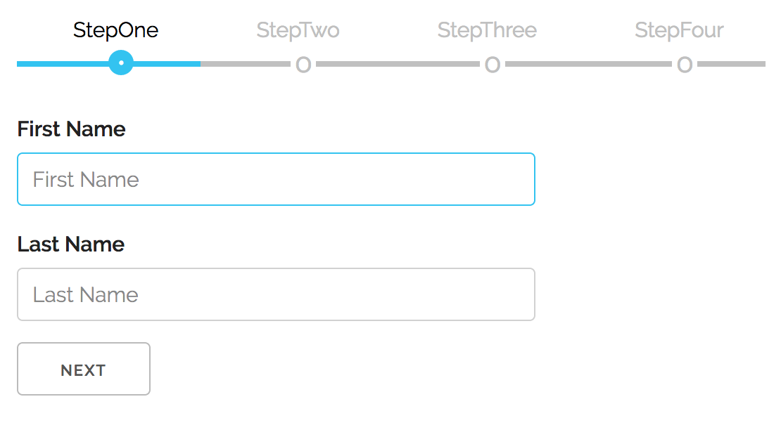
To use this module in your app run:
npm install react-multistepnext, import it inside of your app:
import MultiStep from "react-multistep";and then, in your application, you add your custom components/forms this way:
<MultiStep>
  <StepOne title="Step 1" />
  <StepTwo title="Step 2" />
</MultiStep>;
Because v6 is headless, you provide the surrounding chrome yourself. A minimal layout might be:
import { MultiStep, useMultiStep } from "react-multistep";
import type { StepComponentProps } from "react-multistep";

function WizardChrome({ children }: { children: React.ReactNode }) {
  const { steps, activeStep, goToStep, next, previous, currentStepValid } =
    useMultiStep();

  return (
    <div>
      <ol role="tablist" aria-label="Wizard steps">
        {steps.map((step) => (
          <li key={step.index}>
            <button
              role="tab"
              aria-selected={step.index === activeStep}
              onClick={() => goToStep(step.index)}
            >
              {step.title ?? `Step ${step.index + 1}`}
            </button>
          </li>
        ))}
      </ol>
      <div role="tabpanel">{children}</div>
      <div>
        <button onClick={previous} disabled={activeStep === 0}>Prev</button>
        {activeStep < steps.length - 1 && (
          <button onClick={next} disabled={!currentStepValid}>Next</button>
        )}
      </div>
    </div>
  );
}

function StepOne({ signalParent }: StepComponentProps) {
  const [value, setValue] = useState("");

  useEffect(() => {
    signalParent({ isValid: value.trim().length > 0 });
  }, [value, signalParent]);

  return (
    <WizardChrome>
      <input value={value} onChange={(event) => setValue(event.target.value)} />
    </WizardChrome>
  );
}| Prop | Type | Default | Description |
|---|---|---|---|
children |
React.ReactNode |
– | Steps to render. Each child is cloned and receives a signalParent prop. |
activeStep |
number |
uncontrolled | Controls the active step index. Leave undefined for internal state. |
initialStep |
number |
0 |
Starting step when using internal state. |
onStepChange |
(step: number) => void |
undefined |
Fires whenever the active step changes (manual or programmatic). |
onValidationError |
(activeStep: number) => void |
undefined |
Called when the user tries to advance while the current step is invalid. |
Each child receives a signalParent callback used to report validation state:
props.signalParent({ isValid: boolean, goto?: number });If isValid is false, the Next button is disabled and step jumping forward is
blocked. The optional goto field lets you hint which step the wizard should
focus when navigation fails. When the user tries to advance past an invalid
step, MultiStep will attempt to redirect to goto (clamped to the available
steps) if that target is already valid—handy for summary/review screens that
need to bounce the user back to the first incomplete section.
TypeScript tip: extend the provided
StepComponentPropstype to get full autocomplete forsignalParentand the optionaltitleprop:import type { StepComponentProps } from "react-multistep"; type AccountStepProps = StepComponentProps<{ plan: Plan }>
Any descendant of MultiStep can tap into a hook family to inspect navigation
state or drive custom controls:
import { useMultiStepState, useStepNavigation } from "react-multistep";

function WizardChrome({ children }: React.PropsWithChildren) {
  const { steps, activeStep, currentStepValid, stepCount } = useMultiStepState();
  const { previous, next, goToStep } = useStepNavigation();

  return (
    <div>
      <p>{`Step ${activeStep + 1} of ${stepCount}`}</p>
      <ol role="tablist">
        {steps.map((step) => (
          <li key={step.index}>
            <button onClick={() => goToStep(step.index)}>{step.title}</button>
          </li>
        ))}
      </ol>
      <div role="tabpanel">{children}</div>
      <button onClick={previous} disabled={activeStep === 0}>Prev</button>
      <button onClick={next} disabled={!currentStepValid}>Next</button>
    </div>
  );
}Returns the full context object for cases where you need everything at once. The shape matches the bullet list below.
Prefer these slice hooks for most real-world UIs—they only trigger re-renders when the specific slice changes, which keeps custom chrome components snappy.
Convenience helper that just gives you steps (useful for read-only indicators
or analytics).
All hooks share the same data model:
activeStep: current index (0-based)stepCount: total number of registered stepssteps: array describing each step{ index, isActive, isValid, title }goToStep(step): programmatically navigate to any step (respects validation rules)next()/previous(): shortcuts for relative navigationsetStepValidity(index, isValid): manually toggle a step’s validity (exposed viauseMultiStep()anduseStepNavigation()for async workflows)isStepValid(index): read cached validity for any stepcurrentStepValid: convenience boolean for the active step
When the child form component needs to control the Next button, call
signalParent inside your component whenever validity changes:
useEffect(() => {
  props.signalParent({ isValid: formIsValid });
}, [formIsValid, props.signalParent]);
The example app demonstrates a reusable chrome component that consumes the hook and renders the navigation UI for each step.
Version 6.0.0 includes an optional modern CSS stylesheet with mobile-first, responsive design:
// Import the optional stylesheet
import "react-multistep/styles";
Features:
- Mobile-first responsive design with container queries
- Automatic dark mode support via
color-scheme: light dark - Fluid typography using
clamp()for adaptive sizing - Touch-optimized tap targets (44px minimum)
- CSS custom properties for easy theming
- Modern CSS features:
@layer,light-dark(), logical properties - Backward compatible: Works without the CSS, enhanced with it
Customization:
All styles use CSS custom properties with sensible defaults:
:root {
  --multistep-primary: #1eaedb;
  --multistep-inactive: silver;
  --multistep-bg: #f1f1f141;
  --multistep-spacing-md: clamp(2rem, 3vw, 4rem);
  --multistep-button-size: clamp(2.5rem, 5vw, 4rem);
  /* ...and more */
}
Override any variable in your own CSS to customize colors, spacing, or typography. The component adapts automatically to small screens (mobile) and large screens (desktop) without media queries using container queries.
Start by cloning the repo locally:
git clone https://github.com/srdjan/react-multistep.gitthen:
cd react-multistep            // (1) navigate to the project folder
npm install                   // (2) install dependencies
npm run build                 // (3) build the component
On a successful build, try the example app:
cd ./examples/client-side     // (1) navigate to the example folder
npm install                   // (2) install dependencies
npm run dev                   // (3) build the library + run esbuild dev server (http://localhost:8000)

# optional
npm run build                 // production bundle to ./dist
Now, you can open the example in your favorite browser...